

You can produce a poster, a logo, a pitch deck and a month of social posts without paying for anything, and the free design tools available now are far better than most people assume.
What holds people back is rarely the software. It is not knowing which kind of tool a job needs, and not knowing the handful of rules that make simple work look intentional instead of homemade.
This guide covers the families of tool, what to check before committing, the licensing traps that catch small businesses, and a working method you can apply today. It names no products, because the sensible choice changes and you should compare current options yourself.
Decide what you are actually making
Design tasks fall into a few buckets, and each one wants a different tool.
- One-off marketing pieces: posters, flyers, certificates, social posts, event banners.
- Identity assets: a logo, a colour set, a typeface pairing you reuse everywhere.
- Photo work: cropping, cleaning up and resizing product or profile images.
- Documents and decks: reports, proposals and slides where text carries the load.
- Interface or product mockups: screens and wireframes for an app or website.
Trying to build a logo in a template tool, or a poster in a photo editor, is where most wasted evenings come from.
If the job is mostly words on pages, it is not really a design job, and our guide to free tools for presentations, posters and documents is the better starting point.
The families of free design tool
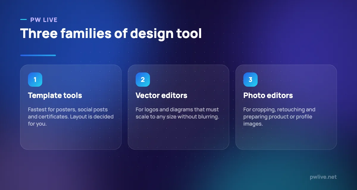
- Browser-based template tools. Thousands of ready layouts, drag and drop, sensible defaults. Best for speed and for anyone who does not want to learn design software.
- Vector editors, including strong open-source options. Shapes and curves defined mathematically, so they stay sharp at any size. The right home for logos, icons and diagrams.
- Raster and photo editors. Pixel-based. For photographs, textures and anything that started as a camera image.
- Interface design tools. Artboards, components and prototypes, aimed at app and web screens.
- Diagram tools. Flowcharts, org charts, process maps. Underrated for study notes as well as business documents.
A useful rule: if it must be printed very large or engraved on a signboard, it needs to be vector. If it came out of a camera, it is raster.
What to check before you commit
Free tools have real limits, and you want to know them before you build twenty assets.
- Export formats. Can you get PNG, PDF and, for logos, SVG? Vector export is the one people discover they need too late.
- Resolution and print settings. Some free tiers export at screen resolution only, which is fine for social and useless for print.
- Watermarks. Check whether free exports carry them, and on which elements.
- Offline capability. Browser tools stop when the connection does.
- File ownership. Can you download the editable source, or only a flattened image?
- Asset licensing. Which fonts, photos, icons and templates are cleared for commercial use, and which are personal-use only.
Verify all six against the tool’s current documentation on the day you choose. These terms change more often than any other part of the software.
Licensing: the trap that catches small businesses
This is the section that saves money.
A font or photograph included in a free editor is not automatically yours to use on products you sell. Many are licensed for personal or editorial use only, and using them on packaging, merchandise or paid advertising can breach the terms.
Protect yourself with three habits:
- Prefer openly licensed assets with clear terms, such as open-source typefaces and stock libraries that state commercial use is permitted.
- Keep a licence record. One sheet listing each font and image, where it came from and what the licence allows.
- Never use a template logo for a registered business identity. Template logos are non-exclusive by design, so someone else may be using the same mark.
For anything that will represent a business long term, treat identity work as worth a small budget or a design student’s commission rather than a template.
The rules that make simple design look good
You do not need talent to avoid looking amateur. You need restraint.
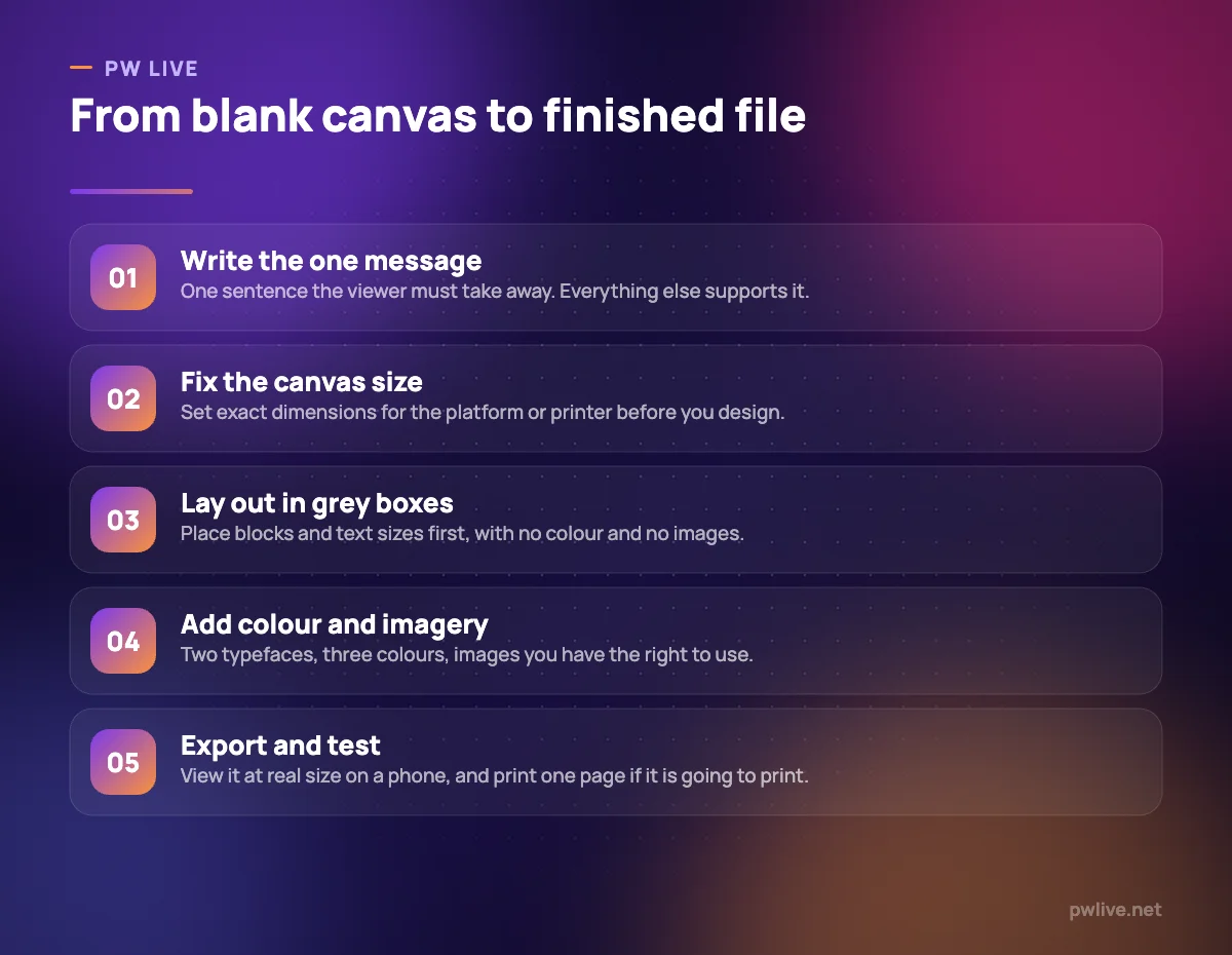
- Two typefaces at most. One for headings, one for body. Many good designs use one.
- Three colours. A dominant, a supporting, an accent. Keep the same three across everything you make.
- Real white space. Crowding is the single strongest signal of inexperience.
- Alignment. Everything lines up with something. Use the guides and the grid.
- Hierarchy. The most important thing should be visibly, obviously largest.
- Contrast. Dark text on light, or the reverse. Light grey on white fails on phones and for anyone with low vision.
- Consistency beats variety. Reusing one layout across a series looks like a brand; five different layouts look like five accidents.
Test at real size before you publish. A social graphic that reads on your laptop can be unreadable on the phone where it will actually be seen.
Build a small reusable kit
Do this once and every future design takes minutes.
- Pick your two typefaces and three colours, and write the colour codes down.
- Make one template per format you use repeatedly: square social post, story, A4 flyer, presentation title.
- Store approved logo files in every format you might need, including a plain white version.
- Keep a folder of images you have the right to use, cropped and ready.
- Save it all in one place and back it up, following how to back up your notes.
For product imagery, better photographs matter far more than better editing, so start with taking good product photos with a phone. Once the kit exists, feed it into a social media strategy on a small budget and use the same assets on your LinkedIn personal brand.
Students building experience should keep every finished piece, because a folder of real work is the fastest route to a portfolio when you have no experience. More on the craft sits in the design and creativity skill track, and more on distribution in our marketing category.
Key takeaways
- Match the tool family to the job: templates for speed, vector for logos, raster for photos.
- Check export formats, resolution, watermarks and offline access before you commit.
- Confirm font and image licences before using anything commercially.
- Two typefaces, three colours, generous space and strict alignment cover most of design.
- Build one reusable kit of templates, colours and cleared assets, then stop redesigning.
- Compare current free tiers yourself, because limits and terms change frequently.
Frequently asked questions
Can I design a business logo with a free tool?
Yes, but avoid stock templates for a logo you intend to register or rely on, since they are non-exclusive. Use a vector editor so you can export a file that scales cleanly.
What file format should I export my design in?
PNG for screen graphics with transparency, JPG for photographs, PDF for print, and SVG for logos and anything that must resize without losing quality.
Are free fonts safe to use for commercial work?
Only if the licence says so. Check each font’s terms, and prefer open-source typefaces with explicit commercial permission for anything you sell or advertise.
How do I make my designs look consistent?
Fix two typefaces, three colours and a small set of templates, then reuse them without exception. Consistency does more for a brand than any individual graphic.
Keep learning with PW Live
Browse every guide in Apps & Tools, or pick a skill track and follow the roadmap step by step.




Leave a Reply