
Cart abandonment is the most frustrating problem in online retail, because these are not cold visitors. They chose a product, added it and then left. The work of persuading them is already done, and something in your checkout undid it.
The reasons are usually mundane. A shipping charge that appeared at the last step. A forced account creation. A page that took too long on a patchy connection. A returns policy nobody could find.
This guide walks through the common causes in the order they cost you money, and what to do about each. Abandonment rates vary enormously by industry, device and traffic source, so ignore any universal benchmark and measure your own baseline first.
Measure your own baseline before changing anything
You cannot improve what you have not measured. Set up your analytics to record four numbers.
- Visitors who view a product page.
- Visitors who add to cart.
- Visitors who begin checkout.
- Visitors who complete the purchase.
The drop between each pair tells you where the problem sits. A big fall between add-to-cart and checkout usually means a cost or trust issue. A fall inside checkout usually means friction: too many fields, a failing payment step, a confusing form.
Look at these split by device. Mobile and desktop behave very differently, and most Indian traffic is mobile, so a checkout that is merely acceptable on a phone is a checkout that is losing money.
Kill the surprise costs
The single most cited reason shoppers abandon carts is unexpected extra cost at the final step. It feels like a bait and switch even when it is not.
The fix is transparency, early and repeatedly.
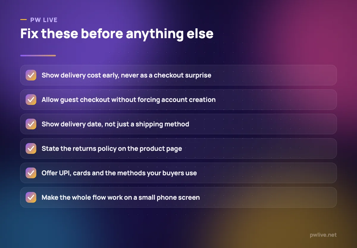
- Show the delivery charge on the product page, or state clearly that it is calculated by pin code and let buyers check before adding to cart.
- If you offer free delivery above a threshold, say so on the product page and show how far the buyer is from qualifying.
- Include any taxes, handling or COD fee in the same visible summary rather than adding them silently.
- Never introduce a new line item after the buyer has entered their address.
Free shipping generally lifts conversion, but the cost has to go somewhere. Building it into the price or setting a minimum order value is usually better than surprising people. Our guide to logistics basics for Indian sellers explains how shipping is priced so you can decide what you can absorb.
Stop forcing account creation
Requiring an account before purchase is a self-inflicted wound. The buyer wants a product, not a relationship, and a registration form is one more reason to leave.
Offer guest checkout as the default path. You can invite the buyer to save their details after the order is placed, when they have already succeeded at what they came to do.
While you are there, cut the form itself down:
- Ask only for what you need to deliver and to contact them.
- Use a single full-name field rather than separate first and last name.
- Auto-fill city and state from the pin code.
- Enable browser autofill by using standard field names.
- Do not ask for a company name, date of birth or optional preferences at checkout.
Every field you remove is a small increase in completed orders.
Make the page fast, especially on a phone
Slow pages lose buyers, and the effect is worst exactly where you can least afford it, on mobile data in the moments after someone decides to buy.
The usual culprits are simple:
- Uncompressed product images. Resize and compress before uploading.
- Too many apps, widgets, chat popups and tracking scripts.
- Sliders, autoplay video and heavy fonts on the checkout path.
- A theme loading assets it never uses.
Test your own store on a mid-range phone on mobile data, not on office wifi on a laptop. Then walk through a full purchase yourself, including entering a real address and reaching the payment screen. Most sellers who do this find at least one thing broken.
Offer the payment methods your buyers actually use
A checkout that does not include the method someone intends to pay with converts at zero for that person.
In India that generally means UPI, cards, net banking, wallets and often cash on delivery. Offer the range your gateway supports, display the logos so buyers can see their method before they commit, and make sure the flow returns cleanly to your site after payment.
Payment failures are a hidden loss. If a payment fails, show a clear message with a retry option and an alternative method rather than dumping the buyer on an error page. Send a follow-up with a link to complete the order.
Cash on delivery raises conversion but costs you fees, delayed cash and refused parcels. A small prepaid discount nudges buyers the right way without removing the option. What digital payments growth means for small businesses covers the wider context.
Answer the trust questions before they are asked
A first-time visitor to an unfamiliar store is asking whether you are real, whether the product is as shown, and what happens if it is wrong. Silence on any of those is a reason to close the tab.
Put the answers where buyers look:
- Returns and refunds summarised on the product page, not buried in a footer link.
- Delivery estimate as a date range, since “3 to 5 days” is less reassuring than an actual window.
- Contact details that include a real way to reach a person, plus your contact page and an about page that says who is behind the shop.
- Reviews and photos from real buyers, which do more for conversion than any badge.
- Security signals at payment: a secure connection and a recognisable gateway.
Genuine reviews only. Fabricating them is dishonest and usually against the rules of whichever platform you use.
Rescue the carts you can
Some abandonment is unavoidable. People compare, get interrupted or change their minds. A polite recovery sequence brings a share of them back.
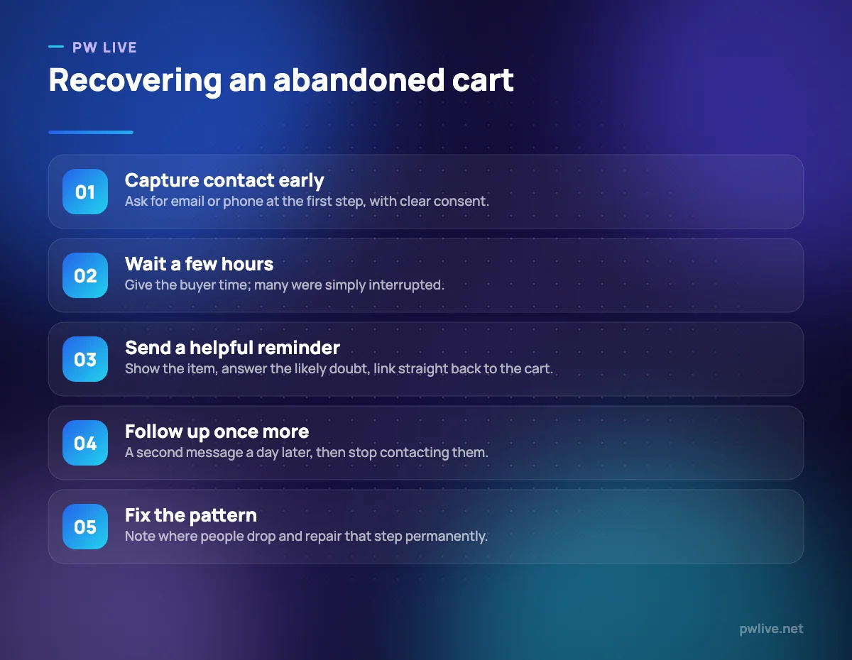
To do it at all, you need contact details, so capture email or phone at the first step of checkout with clear consent about how you will use it.
Then keep it short and useful:
- First message a few hours later, showing the item, with a direct link back to the cart.
- Address the likely doubt in one line: delivery time, returns, or a sizing note.
- A second and final message the next day. Then stop.
- Only offer a discount sparingly, or you train buyers to abandon carts deliberately.
Respect consent and unsubscribe requests, and follow the rules for whichever channel you use. Email marketing basics covers how to set this up without a large budget.
Fix causes, not just symptoms
Recovery messages treat the symptom. The lasting gains come from removing the reason people left.
Every month, look at where the drop-off is largest and change one thing. Rewrite the shipping information, shorten the form, add a size guide, speed up the images. Change one element at a time so you know what worked.
Also look upstream. If your traffic arrives expecting something your page does not deliver, no checkout fix will help. Clear photos and honest copy set correct expectations, which is why product descriptions that convert and product photos with a phone belong in this conversation. For the measurement side, see marketing metrics that matter, the e-commerce category and the digital marketing skill track.
Key takeaways
- Measure your own funnel by device before acting; published abandonment benchmarks will not match your store.
- Show delivery cost, taxes and any fees early, and never add a new charge after the address step.
- Offer guest checkout and strip the form down to the fields you genuinely need.
- Test the full purchase on a mid-range phone on mobile data, and compress images before uploading.
- Offer the payment methods your buyers use, handle failed payments gracefully and nudge gently towards prepaid.
- Recover carts with two short, honest messages and consent-based contact capture, then fix the step people keep leaving at.
Frequently asked questions
What counts as a normal cart abandonment rate?
There is no single normal figure. Rates vary widely by category, price, device and traffic source, so track your own trend over time rather than comparing against a number you read somewhere.
Should I offer a discount in cart recovery messages?
Use it sparingly. Regular discounts in recovery emails teach repeat buyers to abandon carts on purpose, so lead with reassurance about delivery, returns and sizing first.
Does adding a live chat widget help?
It can, if someone actually answers quickly. An unattended chat window that promises help and delivers none is worse than a clearly stated contact number and response time.
Is cash on delivery worth offering if it reduces abandonment?
Often yes, especially for first-time buyers, but weigh it against COD fees, delayed cash and refused deliveries. Many sellers keep it available while offering a small incentive to pay upfront.
Keep learning with PW Live
Browse every guide in E-commerce & Retail, or pick a skill track and follow the roadmap step by step.


Leave a Reply